QUIZ: Can You Guess The Team From These Obscure Logos?
Logos are the primary visual way most of us identify teams in various sports. From the simplistic hand-drawn designs of the early days to the cartoonish logos of the '90s to ornate soccer crests, a strong logo is integral to a team's brand.
This isn't to say that every logo is necessarily a good logo, though. Some of the teams with the most iconic designs only settled on their eventual look after a few rough drafts that didn't quite cut it. Test your knowledge of athletics aesthetics with some of the weirder logos from sports history.
Who wore this halo-adorned logo?
A. Chicago Americans
B. Cincinnati Angels
C. California Angels
D. Columbus Aeros
Answer: California Angels
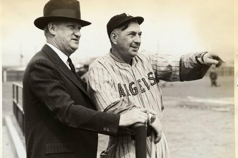
The Angels were founded as the Los Angeles Angels, then became the California Angels, then the Anaheim Angels, then the Los Angeles Angels of Anaheim. Now they're the Los Angeles Angels once more. Throughout their history, they've worn logos with angelic halos.
Who wore this abstract art?
A. Omaha Royals
B. Oklahoma City Thunder
C. Orlando Magic
D. Oakland Seals
Answer: Oakland Seals
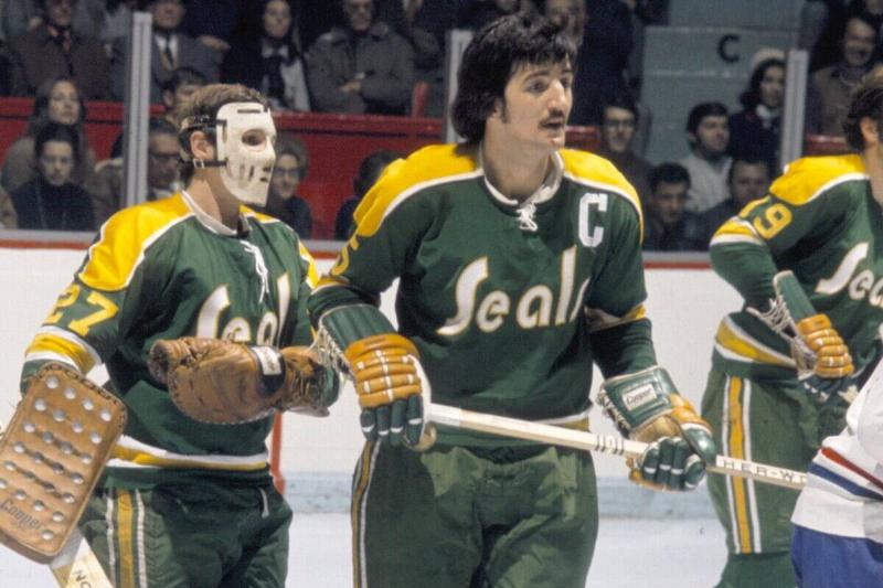
A founding member of the "next six" NHL expansion in 1967, the California Seals/Oakland Seals/Bay Area Seals/California Golden Seals went through a number of name changes during their brief history.
Who's taking the L here?
A. Los Angeles Lakers
B. LSU Tigers
C. LA Galaxy
D. Lake Erie Monsters
Answer: Los Angeles Lakers

This isn't as distinctive as the Lakers' iconic main logo, but the Lakeshow have used this logo as an alternate since the early 2000s. The purple and gold - sorry forum blue and gold - color scheme is a dead giveaway.
Which team rocked this superhero-inspired design?
A. Edmonton Oilers
B. San Diego Chargers
C. Golden State Warriors
D. San Francisco Giants
Answer: Golden State Warriors
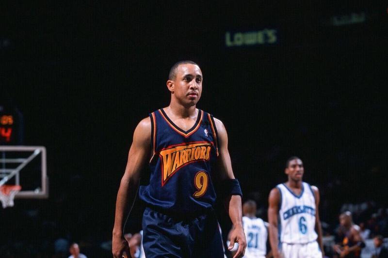
The Golden State Warriors' blue and gold color scheme is iconic, but it's easy to forget that they were a blue/gold/orange team for a time beginning in the '90s. Fortunately, they came to their senses and brought back their original look.
Who uses this bird-centric logo?
A. Atlanta Hawks
B. Atlanta Falcons
C. Philadelphia Eagles
D. Seattle Thunderbirds
Answer: Atlanta Falcons
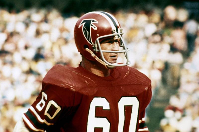
The classic Atlanta Falcons logo isn't too far off from their current-day look - it's just a little less dynamic. The logo shows not just a falcon, but an abstract take on the letter F.
This is obviously a baseball team, but which one?
A. Milwaukee Brewers
B. Montreal Expos
C. Milwaukee Braves
D. Baltimore Orioles
Answer: Milwaukee Brewers

The ball and glove here are obvious, but the logo also incorporates something more subtle: a lowercase 'M' and 'B' hidden within the glove, which, of course, stands for the Milwaukee Brewers.
What team do you get when you combine a basketball and snowflakes?

A. Toronto Huskies
B. Vancouver Grizzlies
C. Utah Jazz
D. Minnesota Timberwolves
Answer: Utah Jazz
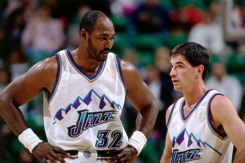
The snowflake shows that this is a team that plays in a cold weather climate, and the basketball shows that, well, this is a basketball team. This is a Utah Jazz alternate logo from their teal, purple, and bronze era.
What's blue and white and bold all over?

A. Columbus Blue Jackets
B. Columbus Clippers
C. Dallas Cowboys
D. Indianapolis Colts
Answer: Indianapolis Colts
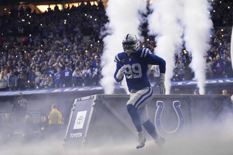
The Baltimore/Indianapolis Colts have barely used any logos other than their iconic horseshoe, but in 2020 they introduced this alternate look. Eagle-eyed viewers might recognize the shape within the C, which shows the outline of Indiana.
An early NBA team had this diabolical logo
A. Philadelphia 76ers
B. New York Knicks
C. Rochester Royals
D. Baltimore Bullets
Answer: New York Knicks
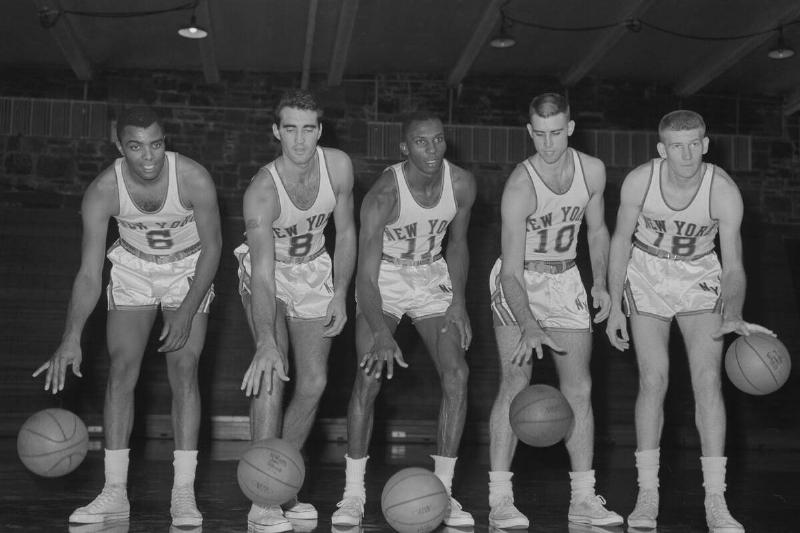
When you consider that "Knicks" is short for "Knickerbockers," this cartoonish image of an old-timey New Yorker makes a lot of sense for the New York Knicks. They really ought to bring this one back.
Many teams have worn a fleur-de-lis, but who wore this one?
A. New Orleans Saints
B. Quebec Aces
C. Halifax Citadels
D. St. Louis Browns
Answer: St. Louis Browns
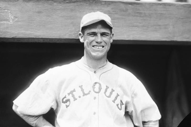
This is almost the exact logo of the New Orleans Saints, just in an orange and brown color scheme. That serves as a clue that this was the logo of the St. Louis Browns (the precursor to the Baltimore Orioles), who wore this logo as a nod to the city's French heritage.
Which NFL Europe team had this look?
A. Scottish Claymores
B. Hamburg Sea Devils
C. Barcelona Dragons
D. Berlin Thunder
Answer: Hamburg Sea Devils
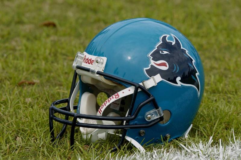
NFL Europe, which followed in the footsteps of the World League of American Football, was a reasonably successful entity for more than a decade. Its German teams, including the Hamburg Sea Devils, saw the strongest fan support.
Did this gunslinger represent a team from the Lone Star State?
A. Dallas Renegades
B. Houston Texans
C. Arizona Outlaws
D. San Antonio Texans
Answer: San Antonio Texans
It isn't surprising that a Texas-based team would wear a logo like this, but it is a little surprising that said team would come from the Canadian Football League. The CFL had a brief, ill-fated expansion into the United States in the mid-'90s.
Which regal team wore this angry-looking monarch?
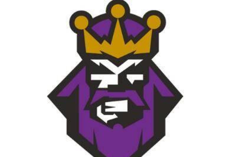
A. Los Angeles Kings
B. Sacramento Kings
C. Sacramento Monarchs
D. Kansas City Royals
Answer: Los Angeles Kings
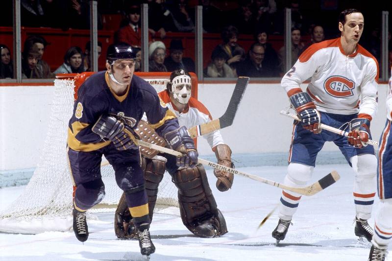
Many teams have gone with regal nicknames and purple color schemes. This Los Angeles Kings alternate logo comes from their original alternate jersey, introduced during the 1995-96 season. This design was jokingly referred to as the "Burger King" jersey.
Which horse-centric team went with this?
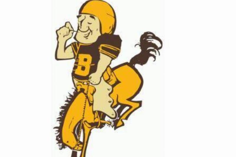
A. Wyoming Cowboys
B. Baltimore Colts
C. Denver Broncos
D. Boise State Broncos
Answer: Denver Broncos
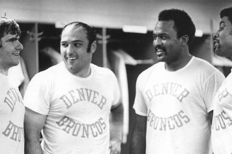
Horse-themed names are commonplace in sports, but brown and gold color schemes are decidedly rarer. Before the Denver Broncos came to their senses and introduced their blue and orange colors, this was how they looked.
Is this a Colts alternate logo?
A. SMU Mustangs
B. Baltimore Colts
C. Birmingham Stallions
D. Baltimore Stallions
Answer: Baltimore Stallions
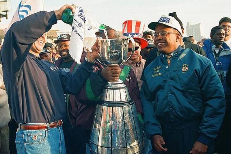
If this reminds you of the Baltimore/Indianapolis Colts, that's no accident. The CFL briefly filled the void for Baltimore after the departure of the Colts and before the Ravens came to town. The CFL team was actually known as the "CFL Colts" before the NFL's legal department stepped in.
What happens when you turn an iconic logo on its side?

A. Binghamton Dusters
B. Plymouth Whalers
C. Baltimore Bandits
D. Binghamton Whalers
Answer: Binghamton Whalers
If you said this was a Hartford Whalers logo, just on its side, you'd be correct. But you'd be more correct to guess that this was Hartford's AHL farm team, the Binghamton Whalers.
Who does this rootin' tootin' mascot represent?
A. Ottawa Renegades
B. Denver Nuggets
C. Sacramento Gold Miners
D. San Francisco 49ers
Answer: San Francisco 49ers
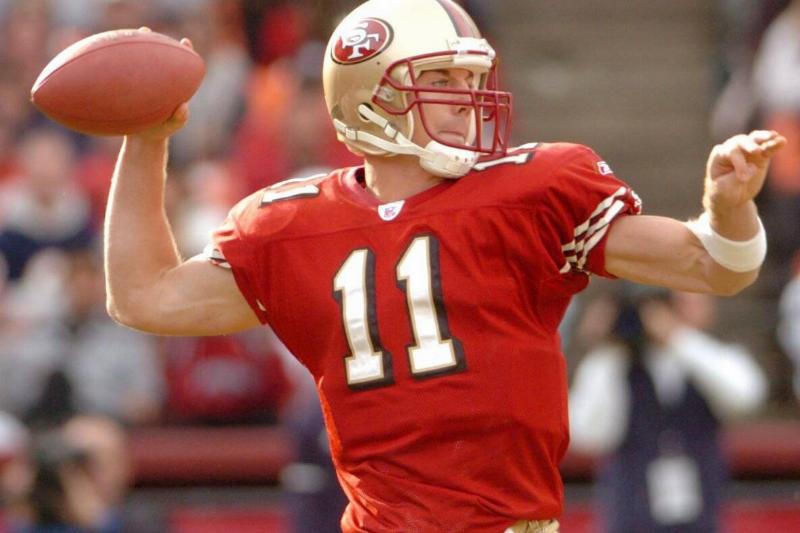
This guy looks a lot like a cowboy, but he's actually supposed to be a gold prospector — one of the many who came to California to seek fortune during the 1840s gold rush. The 49ers adopted it as a logo early in their history.
Shiver me timbers, which swashbuckling team wore this?
A. Pittsburgh Pirates
B. Tampa Bay Buccaneers
C. Seton Hall Pirates
D. Shreveport Pirates
Answer: Pittsburgh Pirates
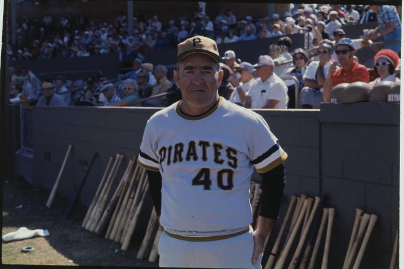
We could have gone with any number of the Pittsburgh Pirates' historical logos, as they've worn various cartoon pirate logos throughout their history. We went with this one, though, as it's probably the most animated.
Which XFL team wore this "xtreme" logo?
A. Orlando Rage
B. Los Angeles Xtreme
C. Chicago Enforcers
D. New York-New Jersey Hitmen
Answer: Chicago Enforcers
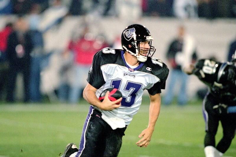
The original XFL went overboard with its team names and logos, and this is one of the more iconic looks from that inaugural season. The Chicago Enforcers were named for the city's history of organized crime.
Who does this screeching bird represent?
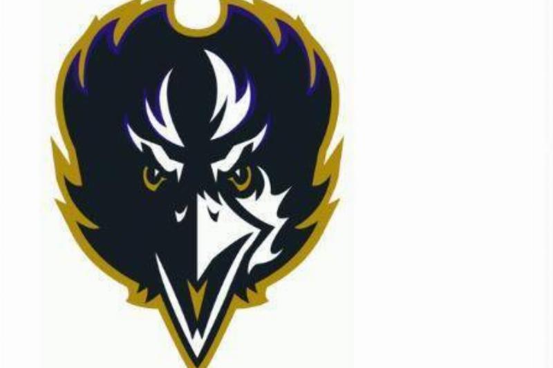
A. Baltimore Orioles
B. Baltimore Ravens
C. Atlanta Hawks
D. New Haven Ravens
Answer: Baltimore Ravens
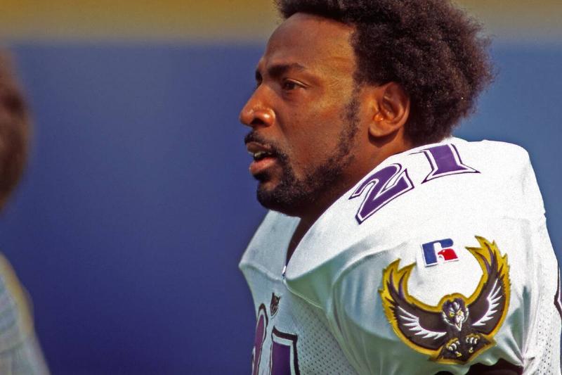
The Baltimore Ravens, named for Edgar Allan Poe's famous poem, have rocked a dark, gothic look for their entire history. This alternate logo was used between 1996 and 1998.
