A Primer on Typography for Non-Designers
When I sat down to write about typography this morning, there was so much I wanted to say that the letters on my keyboard actually sat silent for a good few minutes.
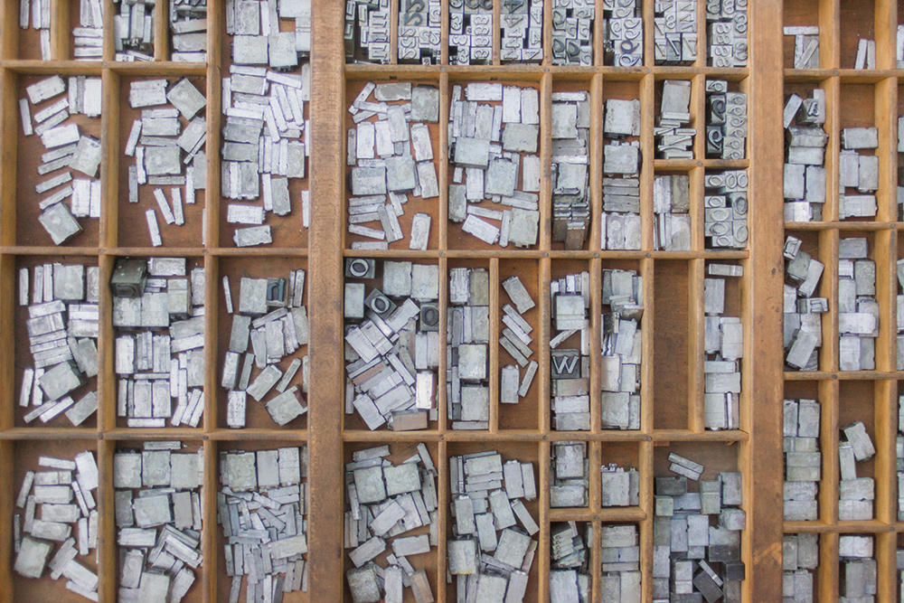
We're in a golden age for typography. Gutenberg totally exploded Europe in the 1500's when he dropped the printing-press-with-moveable-type bomb, but even then, for the next 500 years, the spread of ideas and publishing were in the hands of a collection of specialist craftsmen and the people who hired them. (After all, producing physical objects is expensive.) Then, in rolled desktop publishing in the 80's and—combining computer hardware, software that included digital type, and the ability to effectively “print” on-screen and distribute to other screens instantly via the Internet—you've effectively got a second Printing Revolution happening right now, with type squarely in the middle of it.
Typography was once a niche element, but now we're up to our ears in it. As it is with any craft that takes a lifetime to master, thoughtfulness will set you and your message apart. The craft will give back what you put into it. Using typography in design is a lot like using salt in cooking: when it's used well, it contributes to a greater whole but goes largely unnoticed; when typography calls attention to itself, it's typically been used poorly.
If you've ever been putting together a quick flyer or PowerPoint presentation and wanted to put a little more thought into your font choices, but you feel like you're shooting blindly in the dark because you're not a trained designer, we've put together a quick guide for you.
I. Terms
Let's clear up a little bit of typography lingo before we jump in. These few terms will help you make more informed decisions about which typeface use.
1. Font vs. Typeface
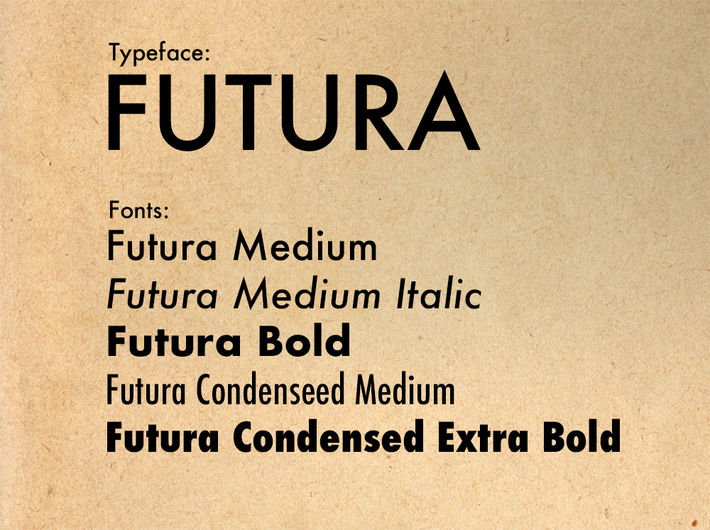
“Font” is the catch-all term for the way letters looks. I personally think this usage totally fine if you're not a designer—frankly, I can't stand it when expert practitioners get snobby about everyone else using their lingo—but there's actually a difference. If you're looking to go deeper in your understanding, it may help you to learn these finer points.
Typeface: A larger family of related letterforms. (Often shortened to “type.”)
Font: A particular instance of a typeface.
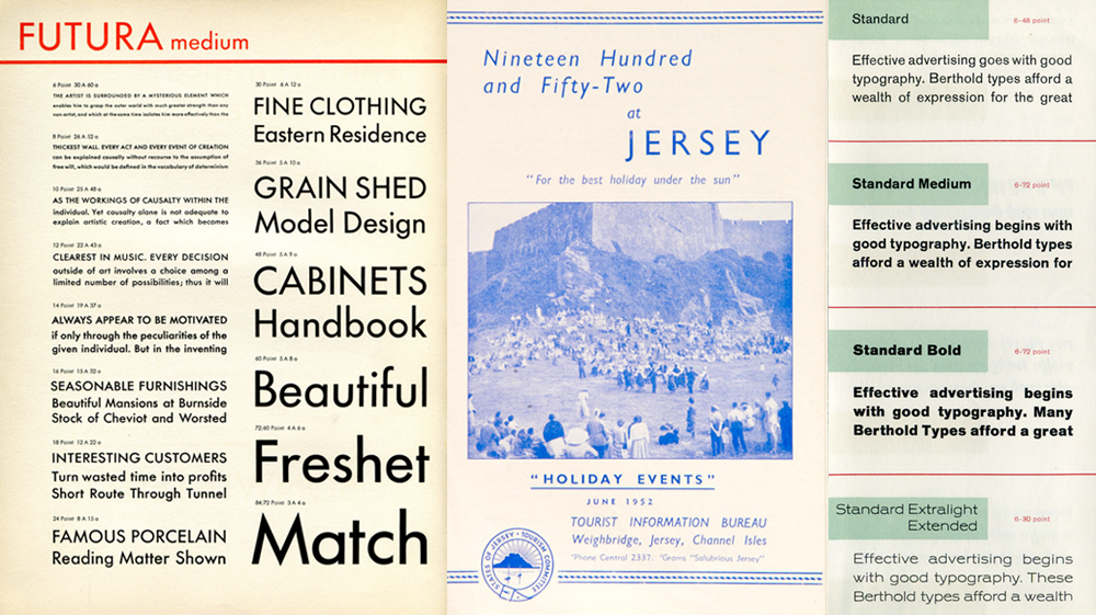
So for our example, Futura is a typeface; under that umbrella, you've got fonts like Futura Regular, Futura Italic, Futura Condensed Medium, and so on. As this FastCo article explains: “The difference between a font and a typeface is the same as that between songs and an album. The former makes up the latter. Remember that and you’re good to go.”
Like I said, it's a fine point—but it's helpful to remember, because it calls to mind that in the world of typography, there are large families of fonts for you to tap into.
2. Serif, sans serif, and script
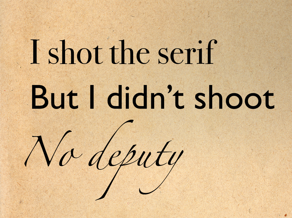
Serif fonts are those with a set of strokes, extending off the edges of their letters. They harken back to the time when block letters were created with fountain pens and show where the pen started a stroke or trailed off.
Sans serif fonts are those without serifs.
Script fonts are ones designed to look like handwriting, most often in cursive form.
Each of these break down into further subcategories, and each has its own “color” and flavor. It's well beyond the scope of this post to discuss how, but again, when you're making your choices it's important to bear in mind.
3. Bonus Bits
Did you know that there are technically three kinds of dashes typically used when designing with type? Check 'em out: [- – —]
Hyphen (-) is the shortest one. This is for connecting words, whether through making-compound-words or for break-
ing a line of type in half.
En-dash (–) is slightly longer than a hyphen, used for indicating a range of items. (Memory aid: it's usually used for numbers, “number” starts with the letter “en.”) Examples: 1–7, A–Z, 1989–1997.
Keyboard shortcut (Mac): option+hyphen.
Em-dash (—) is the longest dash, used for indicating a pause in a sentence—similar to a comma and ellipsis—and which sometimes shows up as a double hyphen–which is a holdover from our dear typewriters.
Keyboard shortcut (Mac): shift+option+hyphen.
II. Usage Rules
Now that we've gotten some terms cleared up, here are a handful of good rules of thumb for the craft of setting type.
1. Don't stretch or squish type.
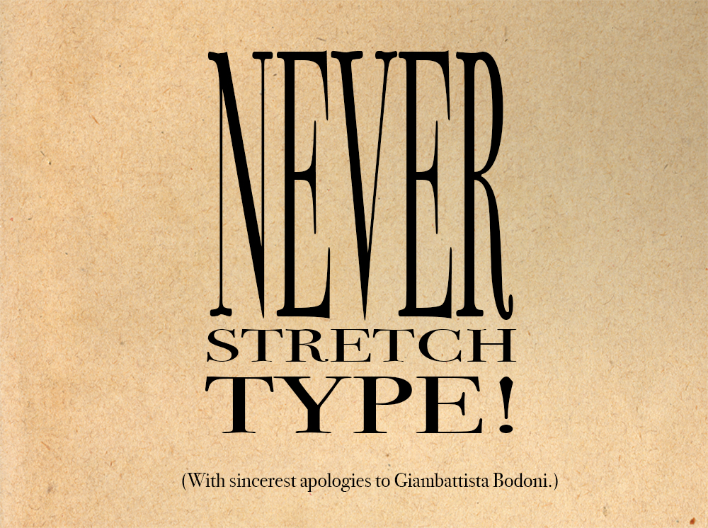
It's just as bad as if you were to take a square photo of your boss and stretch it to fit a rectangular face cake. Type wasn't designed to be flexible. Please, just don't.
2. Avoid stacking letters vertically.
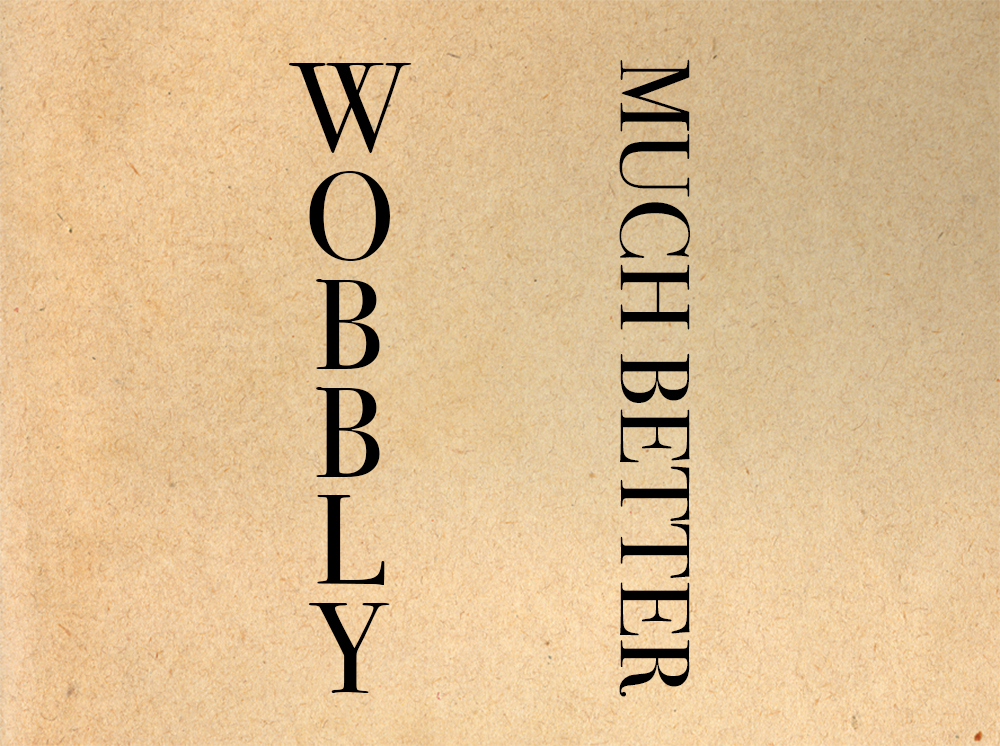
Typefaces were designed to go side-by-side—it's why, for example, Roman letters are all generally all the same height, but vary greatly in width. When you stack them, the space around them doesn't match, and ends up looking wobbly and ultimately distracting.
3. Please care for orphans and widows.
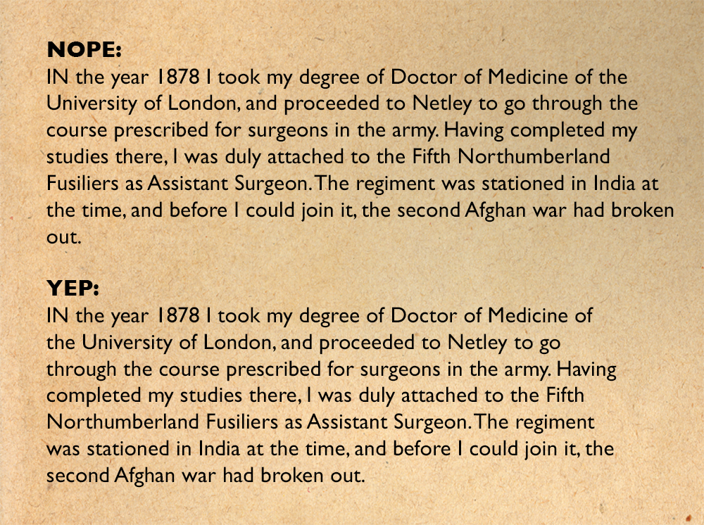
When you're setting paragraphs, make sure that lines of type don't get separated from their families. See the word “out” in the second example? Come on, man, why would you just abandon it like that?
4. Leave a single space between sentences.
This is a hotly contested issue among writers, and even professional associations, with some advocating for the double space and some for the single. (This Huffington Post article is an entertaining and informative article on the subject.) This is a typographer's article, though, and typographers just say no because it creates too much white space after a period.
5. Rule of thumb: no more than 3 typefaces per composition.
There's really no reason to have more. Check what you're using that 4th typeface for, and I guarantee one of your other 3 can take its job.
6. Use a grid.
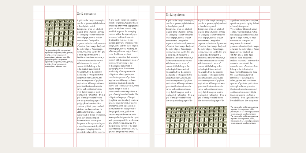
Image source: thinkingwithtype.com
It's important when placing words in a composition that they line up. Try it the next time you're putting a poster together, and you'll see how much more pleasing it is to line up your words and pictures, even just on one side.
7. Break the rules
I love this quote by typographer, designer and author Robert Bringhurst in his introduction to The Elements of Typographic Style: “By all means break the rules, and break them beautifully, deliberately and well. That is one of the ends for which they exist.”
I'd encourage you to know why you're breaking the rules, i.e. to know why the rule you're breaking was holding your project back.
III. Staple Typefaces
There are plenty of fantastic new fonts popping up every day, so by all means, explore! But there are also a handful of beautifully designed fonts that remain a great choice 50, 100, and even 500 years after their creation. These are good places to start.
Serif
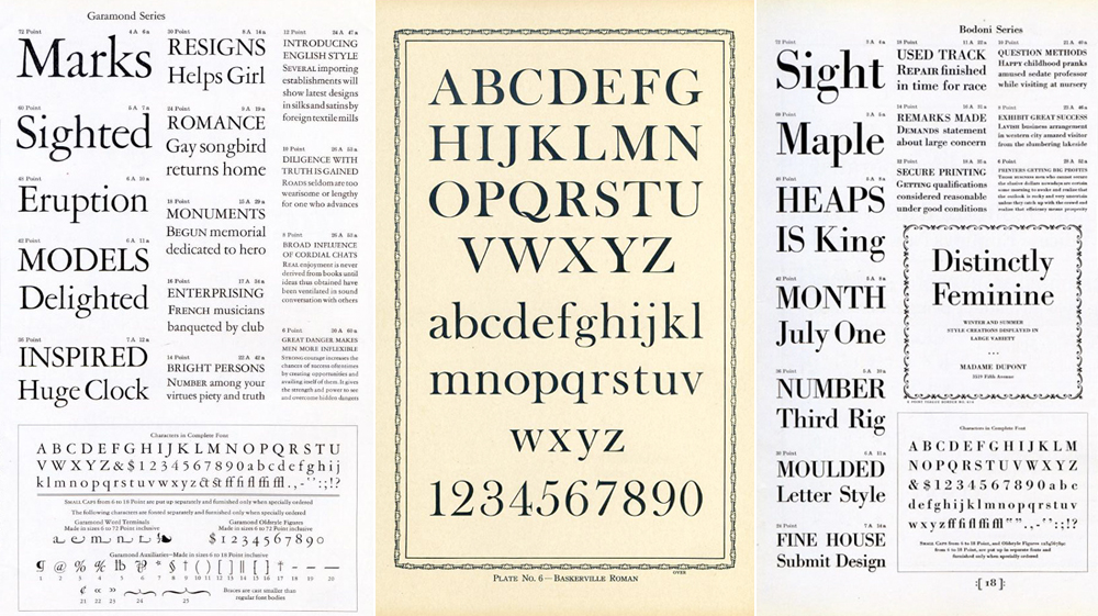
Sans serif
IV. Where to Find Fonts
If you're a Photoshop user, chances are good that you have Adobe's reissues of some classics. If not, or if you're needing something more specific for your project, check out these three good sources of good typefaces.
1. myfonts.com
MyFonts is the flagship font shop. This is where you can buy typefaces from both independent designers and professional type foundries.
Creative Market is a deep, wide source of not only some high-quality, professional-quality fonts from independent designers, but also a one-stop shop for all kinds of creative resources like stock photography, Photoshop effects, and even logos.
Lost Type is another independent typographer marketplace, and it's cool because you can download a font personal use and pay what you want on the honor system before purchasing a license to use it professionally. It's a more curated collection than Creative Market, so there's less choice, but all of them are really good. (Plus, their online shop has a lot of type geek swag like a felt pennant that says “Fonts” on it.)
Further reading:
• Thinking With Type by Ellen Lupton — This was one of my textbooks in design school and it's a perfect beginner's resource on how to use typography—it covers all of your basics concisely and clearly.
• The Elements of Typographic Style by Robert Bringhurst — This is the ultimate type resource when you decide to leap down the rabbit hole. It's jam-packed with everything you'd ever want to know about typography, it's beautifully designed, and it's beautifully written as well. This is one of my favorite books that I own, period, and it deserves its place next to its original inspiration, Strunk and White's The Elements of Style (4th edition, illustrated by Maira Kalman and designed by Best Made Co. founder Peter Buchanan-Smith).
Then look those up on Amazon and check out the suggested books, because there are a ton of awesome ones out there.
Happy designing!
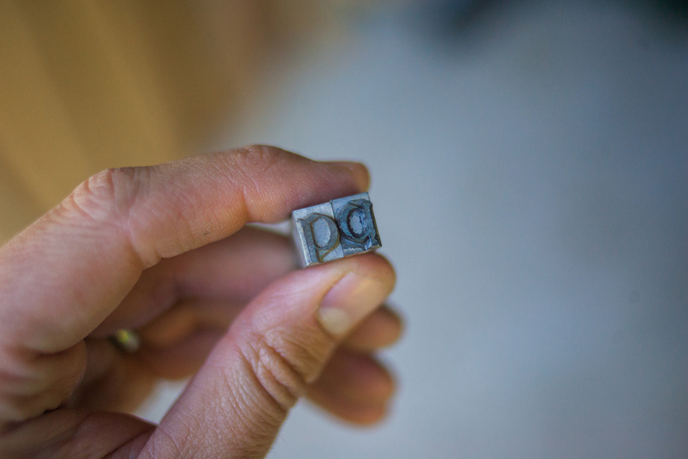
And remember: mind your p's and q's.