Boarding Pass/Fail – Stylish Airline Boarding Pass Re-Design
 The airline boarding pass…
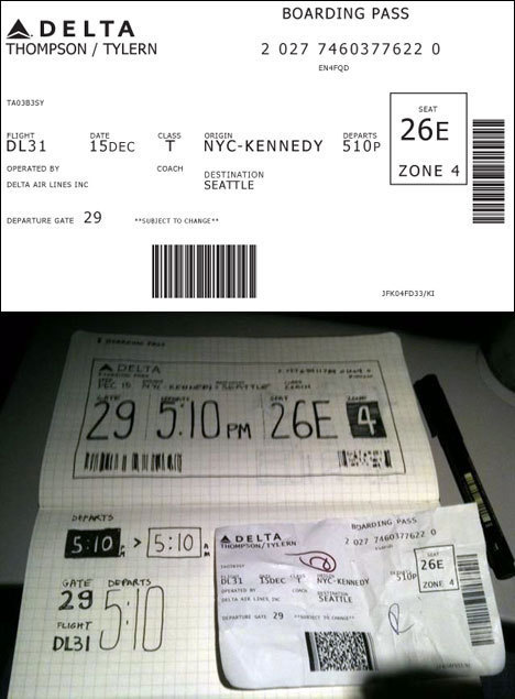
You’ve seen then. Hard to read. Difficult to interpret. Generally aesthetically offensive. Probably not even functional unless you work for the airlines and know all the tricks.
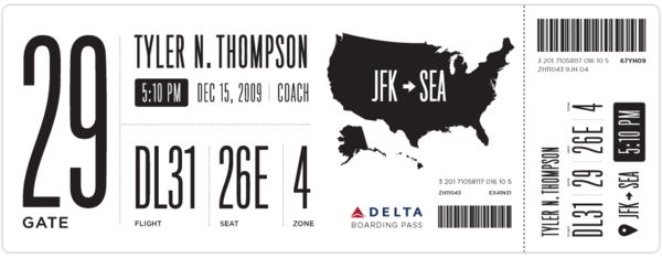
Squarespace Creative Director Tyler Thompson had also seen them, and was equally frustrated, and decided to do something about it…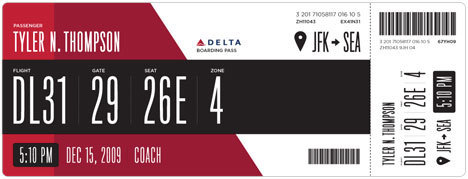
“So I took out my Moleskine and started sketching. I tried to remember my previous trip through John F. Kennedy Airport and when and why I needed to reference my boarding pass. It seemed like I first needed to know which flight I was on. I put the gate right next to this, but made the flight number first because gates tend to change quite often. Next came my seat which I always look at a few times while boarding the plane. After that I put the zone, which is how they board the airplane initially and always seemed like the biggest cluster-fuck of people not knowing what zone they were in or how to find it on their pass. I also did something with the time I think might help, when it was a P.M. time, it was white text on a black box and when it was A.M. it was black text on a white box.”
Plenty of other folks have contributed their own designs as well. See them all in the comments.
Boarding Pass/Fail – Redesigning the Boarding Pass
[via Core77]


